Arabic CalligrapherJoining the heritage of the letter with the tools of today
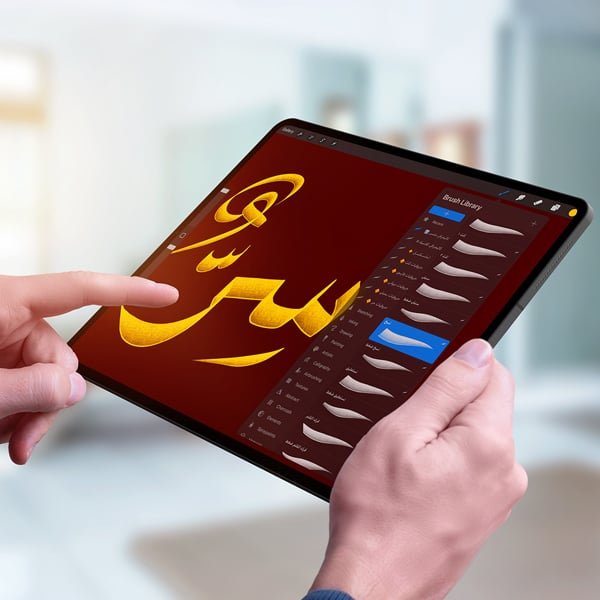
It started with a simple love for the Arabic letter. Today my work moves between pen, ink and screen: film and TV titles, artworks, logos, and digital brushes for calligraphers.
From screen to print: titles for films, programs and series, and calligraphy artworks.
Kind words
People I’ve worked with
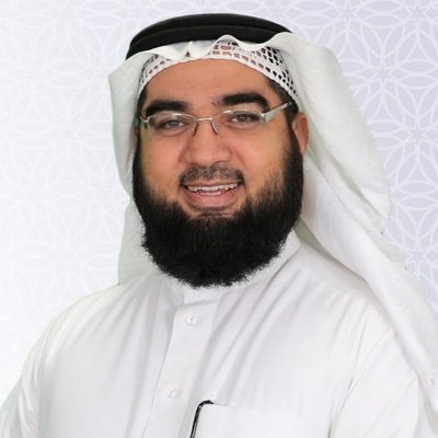
Sheikh Dr. Hassan Al-HusainiIslamic scholar
My prayers are always with you for success. I’m glad we’ve worked together on many programs, and I always look forward to more from your pen.
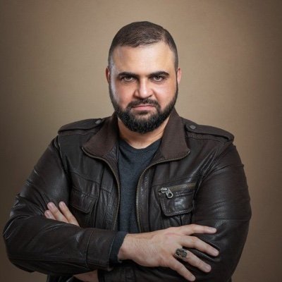
Khaled AlnajjarVoice-over artist
He helped me build my channel’s identity beautifully, and added an unmistakable touch to my work.
Enas YounisJewelry designer
I love Arabic calligraphy, and my pieces are adorned with it. I’ve known Mohamed for years, and together we’ve made wonderful work.
About
My journey with the Arabic letter
I didn’t begin this journey looking for fame or attention, but out of a deep passion for the Arabic letter, and how a simple movement can become a complete meaning. I still approach the letter with the same passion I felt the first time I met it.
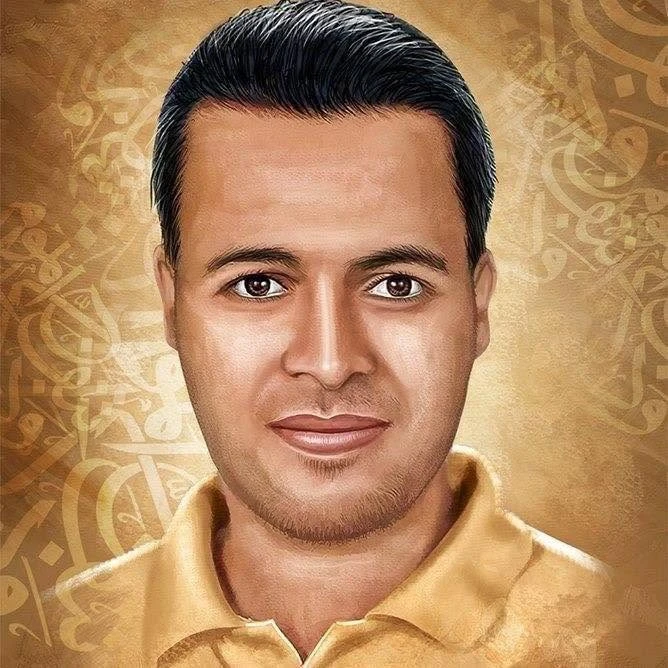
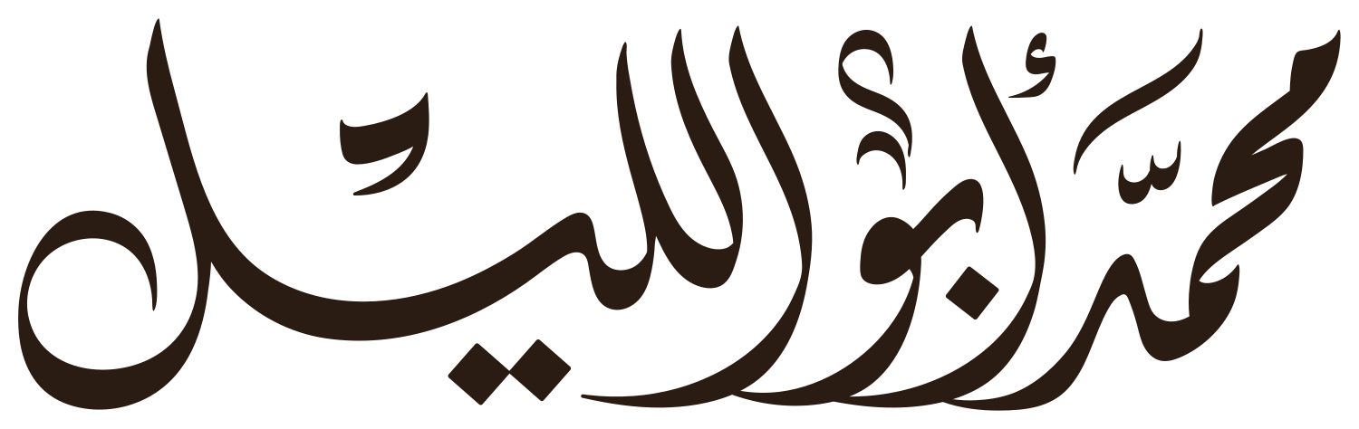
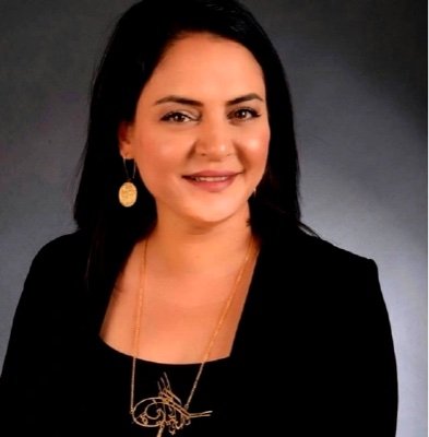
I’m Mohamed Abuelleel, an Egyptian calligrapher born in Fayoum in 1979. I started entirely self-taught, then studied Arabic calligraphy academically, earning two diplomas in the art, before beginning my artistic work between traditional calligraphy and its modern applications.
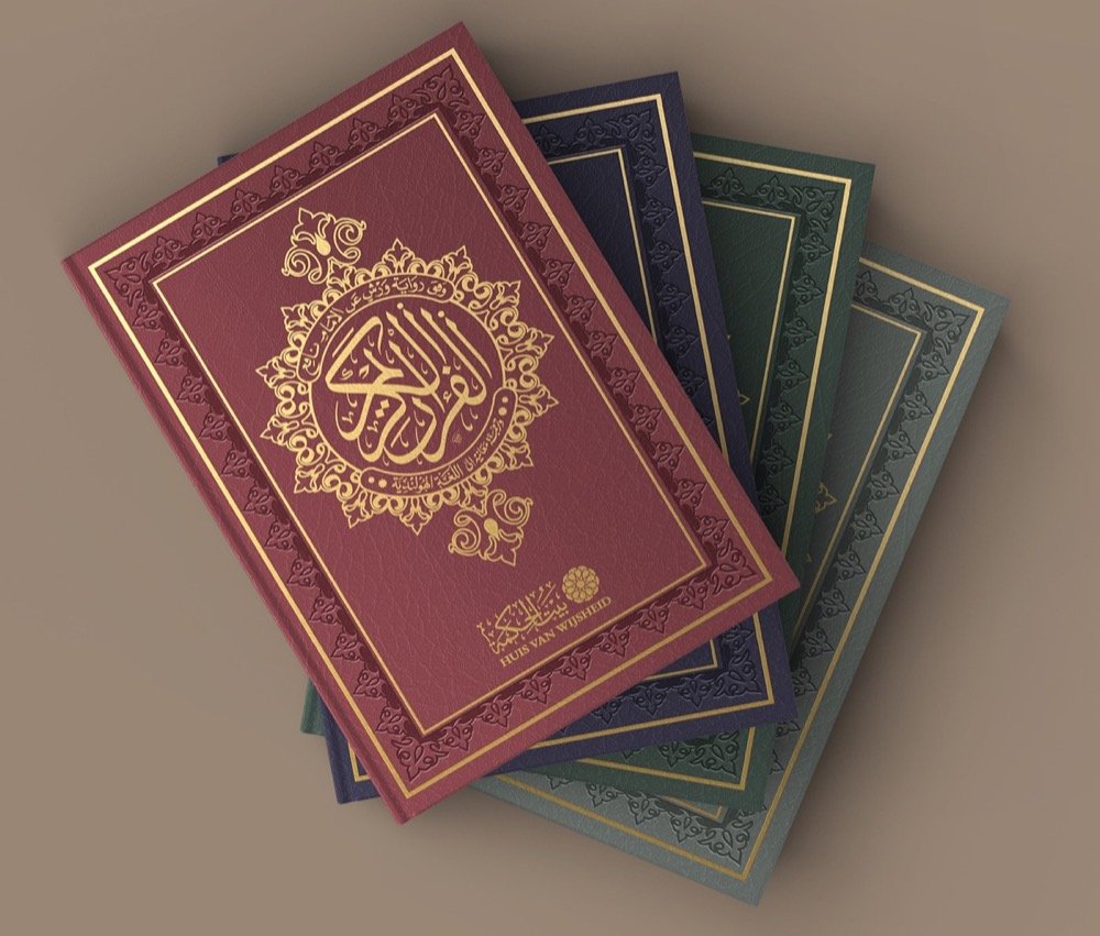
Over the years I have worked with major institutions across the Arab and Islamic world, including the General Presidency of the Two Holy Mosques, the Prophet’s Mosque, Saudi TV, MBC, Almajd TV and Shahid, as well as many production companies, programs and publishers, alongside work for public figures and documentary projects.
I see Arabic calligraphy as a broad experience that goes beyond paper and inkwell. Traditional training is the foundation, and understanding the structure of the letter is what gives an artist discernment. Digital tools, to me, are a natural extension of this art, not its rival. Technology doesn’t threaten the calligrapher; it offers speed, finer control and new possibilities that let the letter live in today’s many spaces. What I offer blends traditional experience with a modern vision: balanced, clean letterforms that keep their authenticity whatever the medium.
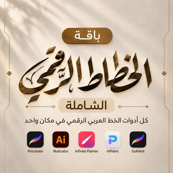
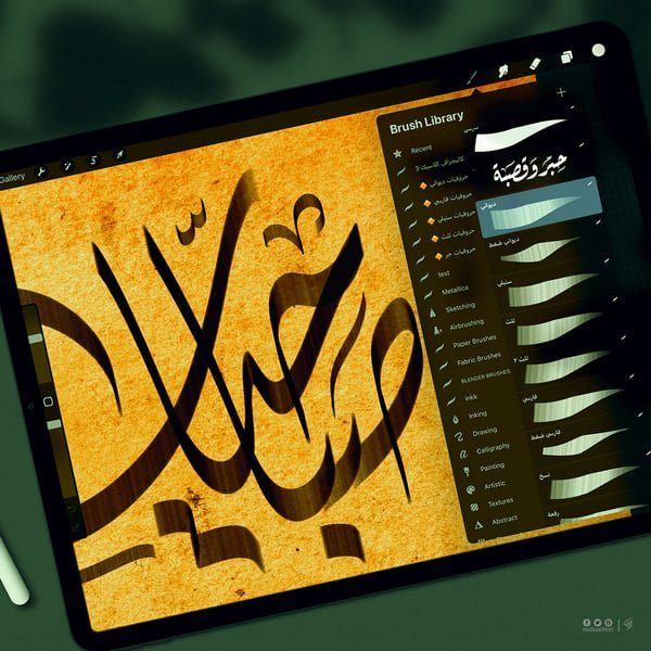
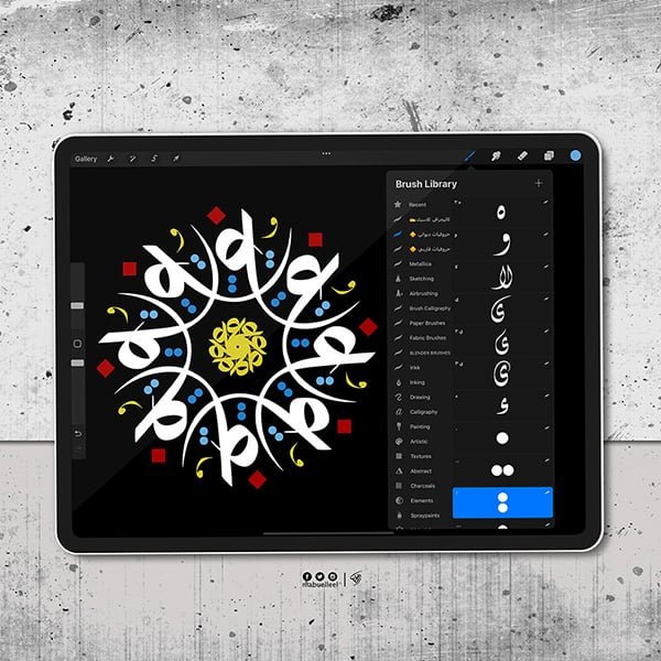
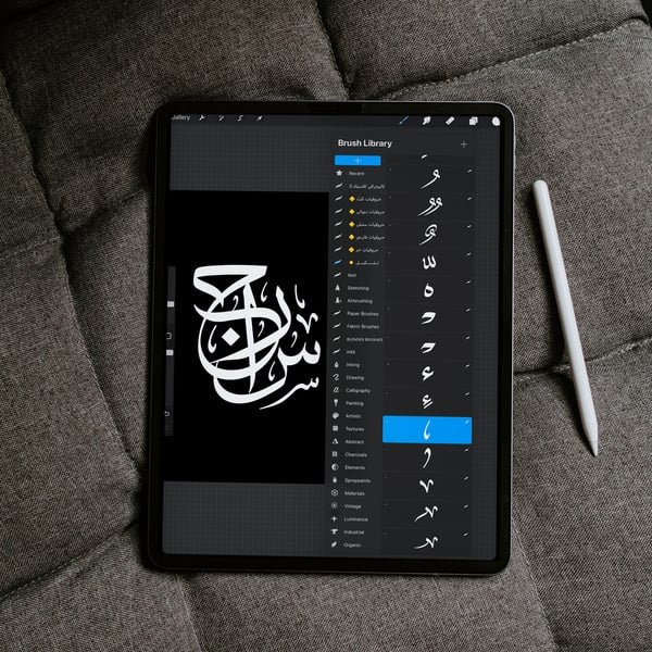
In the digital field, I’m known as one of the first to develop digital Arabic calligraphy tools and materials relied on by artists and students around the world. I have developed Arabic calligraphy brushes for Procreate, HiPaint, Infinite Painter, Adobe Illustrator and GoPaint, through hands-on experiments aimed at bringing the feel of a real pen into the digital space as faithfully as possible, for lovers of this art everywhere, beginners and professional calligraphers alike.
This path has led to collaborations with global companies such as Apple, Adobe and Huawei, contributing to drawing tools for Arabic calligraphy within their platforms. Huawei adopted a number of my brushes and officially integrated them into GoPaint as part of its core drawing tools.
I share what I’ve learned on this journey through my work and consultations. What I offer is not just tools or services, but a long journey in Arabic calligraphy, in which I believe beauty follows no limits, and that a perceptive artist bends every tool to serve the art.
Arabic calligraphy lessons, from traditional tools to the iPad.
12 core lessons
Ruqaa Script Course
A complete course for beginners. I recommend every beginner start with Ruqaa: it is approachable, and you’ll see your progress quickly. The videos are in Arabic; you can turn on English subtitles in YouTube.
This work began when the General Authority for the Affairs of the Two Holy Mosques asked me for a title design for the film “Al-Farida”, a film that presents the Holy Kaaba in a different light: close to the heart, and sincere in feeling.
The lettering had to carry the same spirit: calm… clear… and worthy of the majesty of the place, with no ornament for its own sake.
The idea started from the very first letter, the moment I felt the form needed deeper movement and finer balance, to come closer to the awe of the Kaaba, not just its shape.
The aim was for the lettering to be part of the story, not a title read and forgotten, but a feeling that expresses reverence for a place unlike any other. With every stroke the idea grew clearer: calm movement, clean space, and a final form that hints at the steadiness and peace this noble place holds.
The design you see here is the result of many attempts, yet it stayed true to a principle I always believe in:
The Arabic letter can carry feeling before form, and when it is sincere… it reaches the heart.
That is what I sought in “Al-Farida”: a work that carries something of the Kaaba’s calm… its majesty… and the trace of standing before it.
Design story
Al-Rawda (film)
The design of “Al-Rawda” began with a pause before the meaning of the place itself.
In the first draft I tried a gentle curve for the letter, like the way the Green Dome lifts you toward tranquility. The movement wasn’t clear at first, but it hinted at the way. I returned to it again and again, adjusting the angle of the nib, lightening the weight, and rearranging the spacing until I felt the word breathe the way the place breathes.
The idea was for the script to move gently, never rising suddenly nor falling harshly, but walking calmly… like the steps of a visitor entering the Rawda for the first time.
With each attempt the character of the lettering took shape: soft letters, rounded without excess, and a quiet movement like the moment of standing between the pulpit and the chamber, when everything around you becomes softer and lighter.
I wasn’t trying to make the word look like the dome, but to feel like its trace: the clarity the place leaves inside you after you leave.
And so the design was born simple and clear, carrying peace, and trying to recall the beauty of the Rawda without stating it outright.
Design story · El Adl Group
Omla Nadra (series)
Between harshness and softness… the letter chooses its way
The logo of “Omla Nadra” (A Rare Coin) needed a design that expresses the heroine as the series presents her: a woman facing harsh events who never loses her composure or gives up her feminine presence. So it was essential to choose a script that balances these qualities instead of forcing a look on her that isn’t hers.
El Adl Group’s first suggestion was Kufic, but its sharp lines and hard angles don’t suit a female lead; they give the work a rigid, masculine character that could change the nature of the role.
So we offered several proposals, including one in Nastaliq, which we strongly recommended, even though it is rarely used in TV titles. That was the first challenge. Choosing Nastaliq rested on two main reasons:
It has almost no sharp angles: clearly soft, yet it never loses its presence or strength.
Its balanced beauty gives the word a form closer to the feeling the story builds: quiet strength, and steadiness without harshness.
The title’s link to the idea of rarity also made Nastaliq a natural choice: it is rarely used in drama, distinct in presence, and fitting for a title built on being different.
The result is a distinctive design with a creative idea that reflects the heroine as the series sees her: clear, balanced lettering that carries the strength of experience without giving up its softness, presenting Nastaliq in a modern, unfamiliar way, far from traditional frames.
The proposal was approved the moment it was presented to the producers, without a single change, proof that a thoughtful artist can change convictions and impressions through art, and is not merely a tool of execution but an influence on the outcome.
Design story · El Adl Group
Jamila (series)
A gentle name… carrying a cause
“Jamila” is a young law graduate who vowed to stand for what is right and spread justice, until fate puts her in a dilemma that tests everything she believes in.
The challenge with this name is that it seems soft at first glance, while its bearer holds firm principles inside. So I didn’t want the lettering to settle for surface beauty, but to say that behind this gentleness is a will that doesn’t break easily.
The letters flow in a way that suits a feminine name, and the lower stroke stretches in a wide curve that carries the whole word, like the ground the heroine stands on, between what she believes and what circumstances impose on her.
At the top, some letters end in sharp, slanted terminals, like the moments of confrontation Jamila cannot escape: a measured sharpness that doesn’t break the softness of the name, but reminds us the road was never easy.
True beauty is not in softness of form alone, but in the steadiness hidden behind it.
Gold on the dark background gives the name its warmth and worth, just as the heroine stands by her principles in a world growing ever more mysterious.
Collaboration story · Saudi TV and Shahid
Mihrab Al-Haramain
Deceptively simple… in Ruqaa
The “Mihrab Al-Haramain” logo was the starting point of this project. It had to stand on its own: authentic and unconventional, far from the typical, expected scripts.
From the first moment, the challenge was to create a new calligraphic identity that shows the value of the work without repeating the usual templates of this kind of program. That is why I turned to Ruqaa, but with a different approach and treatment.
Ruqaa is rarely used in artistic compositions, and choosing it was a bold step, since it is not usually used for logos or titles with a strong visual presence. Yet that rarity is exactly what made it the strongest choice: it achieved the principle of the “deceptively simple”, gave the design a modern, balanced Arabic look, completely different from the expected Thuluth, Naskh or Nastaliq, and created a new visual character without compromising the authenticity of Arabic writing.
I used Diwani for the names of the imams of the Haram, because it sits naturally beside Ruqaa without clashing, and gives a modern, pleasing look. The result stepped away from the usual styles: unfamiliar creativity, but carefully measured, so viewers feel each piece belongs to a new vision of the identity.
The guests’ names, more than 150 pieces, were a challenge of both time and craft. It would have been impossible to produce that many in such a short time with traditional tools, and this is where digital tools proved their strength. We completed the work entirely by hand, using iPads and pen displays, with the precision and quality the work demanded.
The contemporary calligrapher is not asked to stay away from today’s tools, but to use them wisely, to offer an authentic letter in a modern form.
That is what allowed the project to combine the dignity worthy of the Two Holy Mosques with the modernity of contemporary television, on Saudi TV and on Shahid.
Design story · Saudi TV and Shahid
Rijal Abdulaziz
A whole production in handwritten calligraphy… down to the last name
“Rijal Abdulaziz” (The Men of Abdulaziz) is a documentary series telling the life of the founding King through interviews with those close to him and stories told for the first time. Spanning 17 episodes, it was one of the largest projects I have worked on.
The work went far beyond a single logo: we designed it in several forms and several scripts, used in the program’s intro and its promos, so every appearance of the name carried the same gravity with a different spirit.
Each episode has a central figure, whose name we wrote in Thuluth, worthy of the people who shaped part of the Kingdom’s history. The guests’ names across all episodes were written in Naskh, for its clarity and harmony with Thuluth.
The biggest challenge was time. The calligraphy was requested late, production depended on it, and the time available was very short, so short that the producers considered dropping handwritten guest names and using a ready-made font instead.
But we insisted the whole work be handwritten, guest names included, and delivered on time at its very best.
By God’s grace, the work was delivered on schedule with a complete calligraphic identity: a logo in multiple forms, figures’ names in Thuluth, and guests’ names in Naskh, all written by hand.
Design story · Hajj and Umrah Research Institute
Journey of Rituals (film)
Two words… rising as hearts rise
“Journey of Rituals” is a cinematic documentary produced by the Custodian of the Two Holy Mosques Institute for Hajj and Umrah Research. It follows the journey of Hajj as pilgrims move between the holy sites with ease, and highlights the purposes of this great rite.
The challenge was for the name to carry the meaning of the journey itself: great crowds moving toward one goal, passing from one holy site to the next in calm and order.
So the composition gathers in: the letters meet and rise toward a single peak, like the hearts of pilgrims all turning in one direction. Small marks spread around the letters like the pilgrims’ footsteps between the holy sites.
I wanted the two words to move the way pilgrims move: many crowds… one direction.
The name rests calmly in the sunset sky above the pilgrims’ steps, giving it a light worthy of the journey of a lifetime.
Design story · Two Holy Mosques Authority
Oyoun Al-Mohibbin (film)
A script no one disagrees on… for a place no one disagrees on loving
“Oyoun Al-Mohibbin” (The Eyes of the Lovers) is a cinematic film about the Prophet’s Mosque, full of faces, features and countries, all joined by one longing for the place.
I chose Diwani for this title because it is loved by everyone, Arabs and non-Arabs alike, whatever their background; people like its shape and feel at home with it at first sight. That is exactly what unites the lovers in this film: they come from the east and west of the earth, joined by one love.
In the word “Oyoun” (eyes), Diwani offers a beautiful touch with no effort: the letter ʿayn takes the shape of a human eye, an eye looking upward, so the letter speaks the meaning before the word is even read.
The letter endings, like the alif and nūn in “Oyoun” and the nūn in “Al-Mohibbin”, break out of the composition and rise upward at a lifted slant, like a hand raised to the sky, or an eye gazing up in longing to see. There is humility and devotion in them, and at the same time elevation: letters rising from the earth to the sky, like supplication and prayer.
I wanted the script to be soft and gentle, expressing love through circling, turning movements, as if the eyes were drawn around the place and the hearts turning with them, with a spiritual, soft character that pleases the eye.
Compositions in Diwani are never disputed, just as people never dispute their love for the Prophet’s Mosque, the Grand Mosque and the holy sites.
Design story · Two Holy Mosques Authority
Tashreef wa Inaya (film)
The honor of service… in the order of the letters
“Tashreef wa Inaya” (Honor and Care) is a documentary highlighting the work of the General Authority for the Affairs of the Grand Mosque and the Prophet’s Mosque during the Hajj season of 1445 AH: organizing and caring for the guests of God, through the hands of its dedicated people.
The challenge was for the title to carry two meanings at once: the honor of serving the Two Holy Mosques, and the precision, order and constant work this service demands.
So the two words sit on one long line, the letters standing in an orderly row, with diacritics spread above and below in a balanced rhythm, like the rows of those serving the guests of God: each in their place, all serving one purpose.
I wanted the name to look the way service looks in the Two Holy Mosques: calm, orderly, its effort seen only in the beauty of the result.
A quiet gold against the dark scene gives the name a dignity worthy of the honor of the place and its people.
Design story · Al-Husaini Academy
Khulasat Al-Tafsir
Vast meanings… in two words
“Khulasat Al-Tafsir” (The Essence of Exegesis) is a program by Sheikh Hassan Al-Husaini, produced by Al-Husaini Academy, explaining the Holy Quran in short, clear episodes. It began with Surat Al-Baqarah in twenty-nine episodes.
The challenge was for the title to carry the program’s own idea: gathering vast meanings into a brief phrase without losing their depth or dignity.
So the two words form one cohesive composition, the letters interlocking into a balanced mass, while the upright letters rise steadily and the endings curl into soft curves that give the word movement and life.
I wanted the title to be like an essence itself: small in space… rich in meaning.
Gold against the dark gives the name a calm light worthy of the Book of God, and of a circle of learning where students gather.
Design story · When You See the Voice
Salou Al-Tarikh (nasheed)
Letters standing tall… like the opening verse
“Salou Al-Tarikh” (Ask History How Much Glory We Wrote) is a nasheed produced by “When You See the Voice”, with voice-over by Khaled Alnajjar, performed by Nayef Al-Sharhan and Ahmed Al-Nafees, with lyrics by Ahmed Abdelmoneim.
The lyrics are all pride, dignity and racing toward greatness, so the challenge was for the title to carry that spirit at first sight, before a melody is heard or a verse is read.
The alifs and lāms stand tall and upright, rising in one row like raised banners or monuments of glory, while the lower letters stretch wide and steady, carrying the whole word like firm ground beneath that structure.
I wanted the letters to stand the way the nasheed’s meaning stands: tall… bowing to none but God.
The title shines in bright silver at the center of the image, the first thing the eye sees, just as the opening verse is the first thing the ear hears.
Design story · My first collaboration with Thmanyah
Socrates podcast logo
A name that asks… in a calm letter
“Socrates” is a podcast by Thmanyah, hosted by Omar Al-Juraisi. It takes people’s questions about Saudi Arabia’s transformation and puts them on the table of the leaders driving it. This logo was my first collaboration with Thmanyah.
The challenge was for the name to carry the spirit of the show: a serious conversation built on questions, yet close to people and free of pretension. The name comes from a philosopher known for his questions, so its lettering had to be confident and calm at once.
The word is short and clear, its horizontal strokes flowing with a contemporary presence, and its endings bend softly, closer to conversation than to speech-making, in keeping with Thmanyah’s simple visual identity.
I wanted the letter to be like a good question: simple in form… deep in effect.
The logo sits in pure white, resting lightly on the host’s portrait without crowding it, as a question sits on the table waiting for its answer.
Design story · Mics
Asmar podcast logo
Night talk in verse… a letter at ease
“Asmar” is a podcast by Mics, hosted by Faisal Al-Shahrani, Hammoud Al-Sahoud and Abdullah Al-Anazi: spontaneous literary evenings that bring together the beauty of poetry, ease and humor.
“Asmar” are the night conversations friends share, so the challenge was for the logo to carry the warmth of that gathering: elegant enough for poetry and literature, and as close to people as an evening among friends.
In such evenings, talk moves between those sitting together; one starts a thread and another carries it on. So we relied on the extensions and kashidas that Taʿlīq script is known for, letting the word stretch and connect the way conversation stretches and connects between friends.
We even reshaped the diacritics: the small sīn, the fatḥa, and even the sukūn itself became moving marks going back and forth, like waves of conversation in the stillness of the night, or people passing the thread of talk between them.
We made even the sukūn (the mark of stillness) move… because in Asmar, the talk never rests.
Design story · Al-Husaini Academy
Al-Arbaeen Al-Bukhariya
The dignity of Hadith… in a reassuring letter
“Al-Arbaeen Al-Bukhariya” is a program by Sheikh Hassan Al-Husaini studying forty hadiths from Sahih Al-Bukhari. It opens with an introduction to Imam Al-Bukhari, who recorded for the Ummah the authentic sayings of the Prophet ﷺ.
The challenge was for the title to carry the dignity and trustworthiness of the science of Hadith, while staying clear and approachable, readable by a beginner as much as a student of knowledge.
So the two words sit on two balanced lines with steady, clear letters, the alifs and lāms rising in an orderly row like an unbroken chain of narration, and the endings flowing calmly without excess or ornament.
I wanted the letter to be like an authentic narration: clear, connected, and reassuring to whoever reads it.
Gold on deep blue gives the title a quiet gravity worthy of a gathering where the words of the Messenger of God ﷺ are recalled.